Role: Design, Illustration, + Hand Lettering
Insight
Taylor Guitars and Karl Strauss Brewing, two San Diego brands known for craftsmanship, joined forces to create a limited-edition beer that honored their shared commitment to sustainability, quality, and artistry. The collaboration centered on the Skagit Valley, a region that supplies both Taylor’s sustainable maple and Karl Strauss’ malt. The creative challenge: capture the heritage of both brands, tell a meaningful sustainability story, and bring the beer’s name–614, referencing Taylor’s maple-bodied guitar model–to life in a visually rich and emotionally resonant way.
Idea
I designed a label that symbolized harmony between music, nature, and craft, featuring a guitar transforming into a maple tree, surrounded by hand-drawn details that reflected both beer and instrument-making traditions. The concept leaned into woodblock printing as a subtle nod to Taylor’s sustainable practices, while weaving in storytelling moments specific to the beer’s ingredients, geography, and seasonal release.
Execution
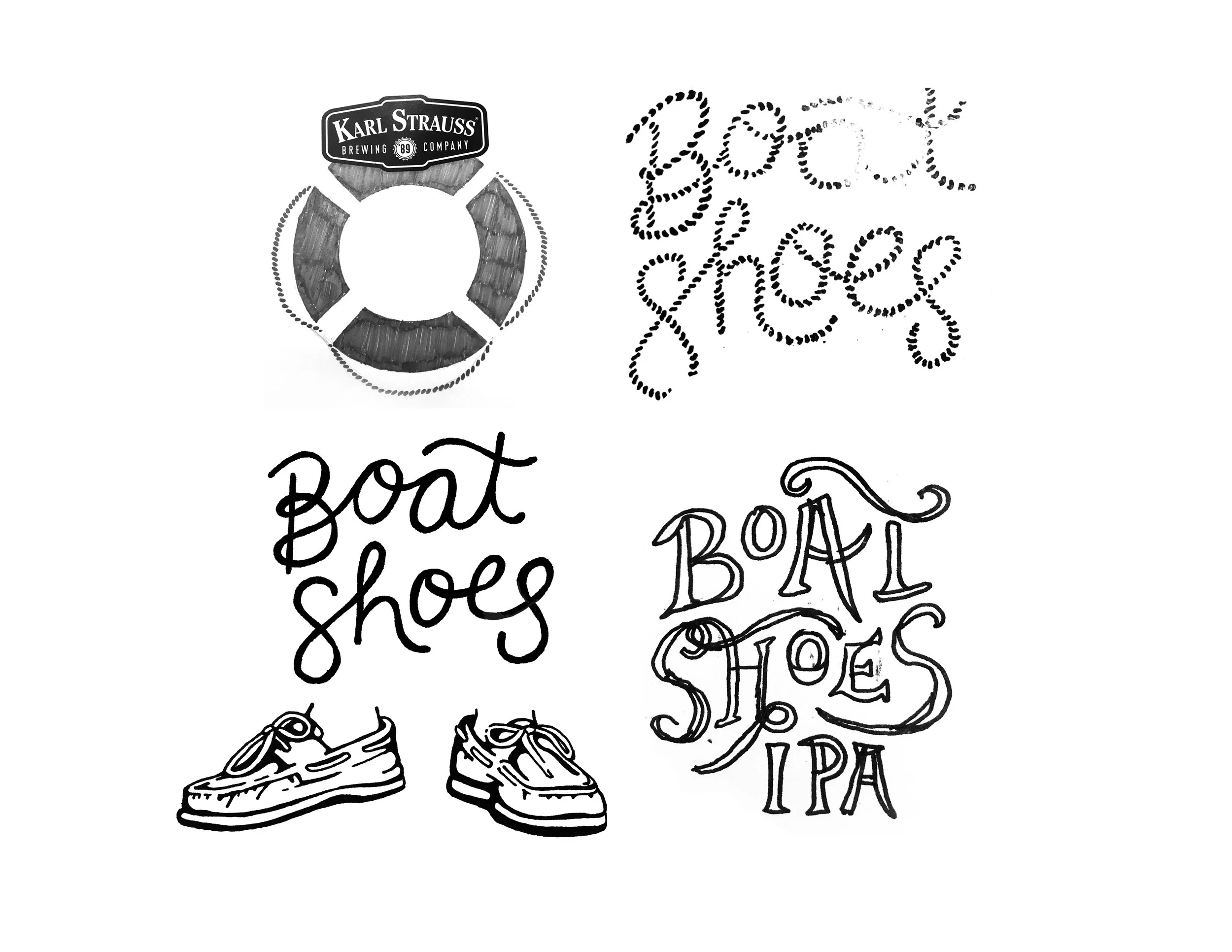
This was my first beer label design, and I approached it with deep attention to detail and material authenticity:
Custom illustration of a guitar morphing into a maple tree, symbolizing Taylor’s shift to fast-growing, sustainable maple
Barley textures embedded into the label border and background, representing Karl Strauss’ malt sourced from Skagit Valley
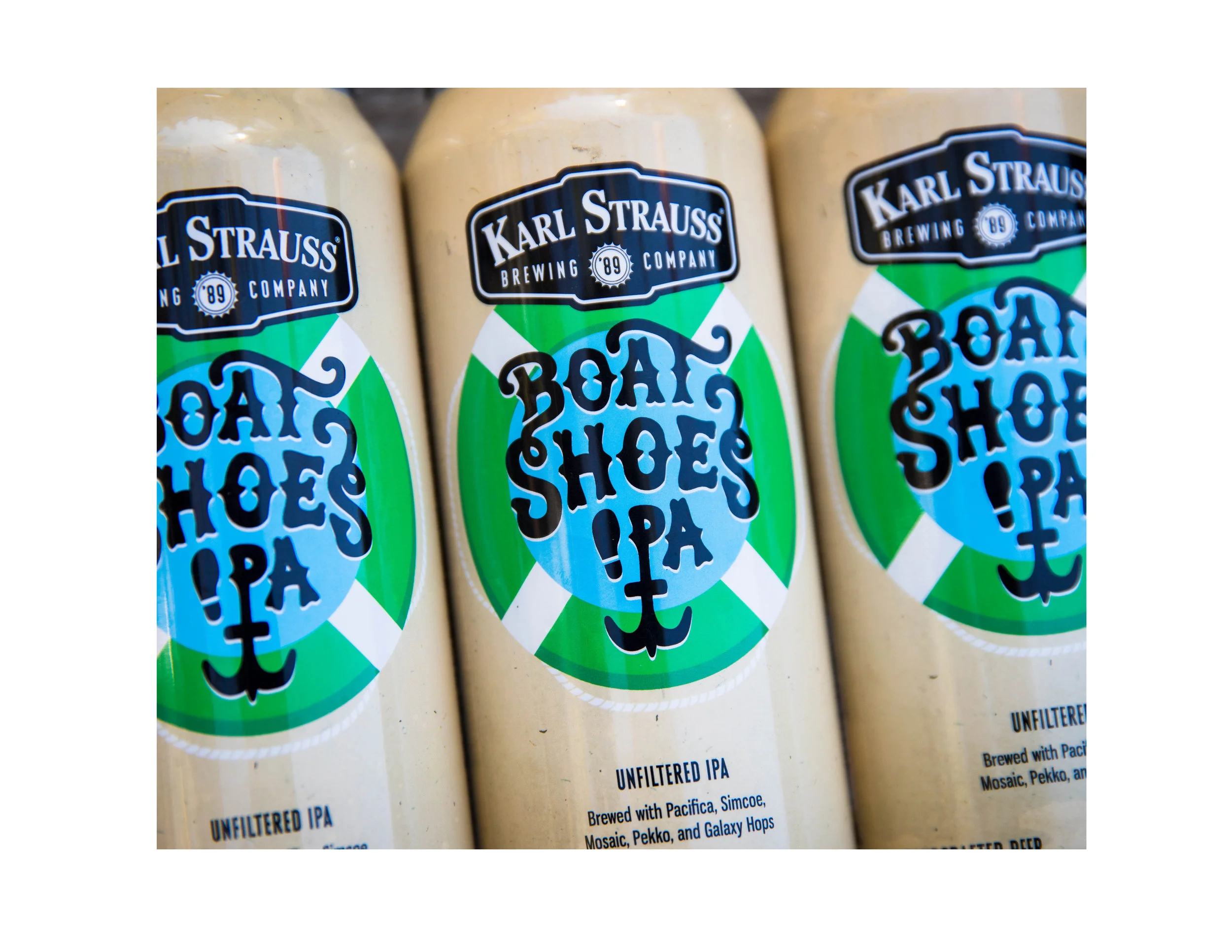
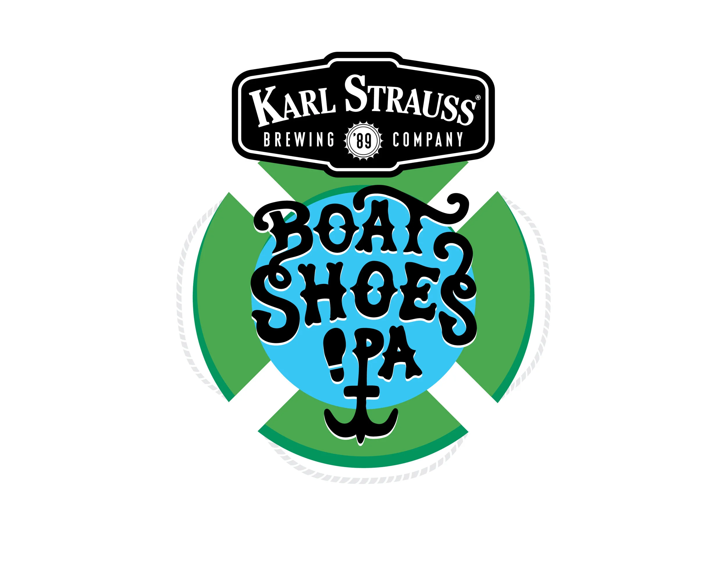
Hand-lettered typography, with rough edges to reflect the human touch behind every element of brewing, guitar-making, and design
A “614” hidden in the maple leaf, a quiet detail for those who look closely
A new die-cut label shape inspired by the tree canopy, breaking from Karl Strauss’ traditional circular badge
A warm, autumnal color palette that echoed both maple leaves and the beer’s vibrant farmhouse character
Beyond the label, I extended the visual system across shirts, posters, glassware, Snapchat filters, and digital assets—ensuring the story carried across all brand touchpoints.
Outcome
The release of 614 Farmhouse Ale was met with enthusiastic praise and regional press coverage, including features on Fox 5 and 91X. The campaign celebrated not just a collaboration between brands, but a shared ethos of sustainability, craftsmanship, and community. It also stood as a memorable example of design as storytelling, where every visual element had a deeper meaning—rooted in place, purpose, and partnership.